The Gradual Degradation of Video Game Box Art
Video games are art. Not just should be considered, they are. People spend hundreds of hours working on artwork, coding, sound design, writing for this. What may seem like a couple hours to some is the life's work to others. This is why I get so mad over the slowly worsening effort into box art.
Yes this is a sorta sequel to my last article. Also this has a metric ton of images so if your internet's slow you might wanna sit this one out. I normally dont include pictures in my writing but this needs it.
Box art is the first thing you see when you buy a game. It sets your expectations on how it is and it's setting. Take a look around your local gamestop or target, specifically the xbox and playstation aisles, maybe nintendo to an extent. Theyre like movie posters, in a bad way. Most modern game artwork is generic, and low effort. Just some random characters standing around or a big guy's face.

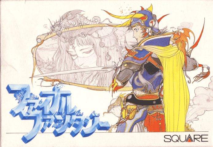
Take for example final fantasy. Notice the sort of ethereal linework? The vibrant colors in some areas, and muted ones in others? Thats all intentional, and the style of Yoshitaka Amano, and its what hes known for. Take a second to look him up, you wont be disappointed. Now take a look at this.

While you could say its not that good, I beg to differ. The logo is what stands out here, and for good reason. Everything else is blank! Its extremely minimalist, but not in the modern corporate souless way. It exudes confidence. Imagine having a game so well known that you could make a blank box and people will immediately know its gonna be good!

Now see this? This is how you make a bad cover art. Doesnt look too bad at a glance until you know how great the other ones could be. This just looks low effort, just random guys and faces, like a modern movie poster.
Now lets take a look at another game series by another artist. Shin Megami Tensei (Yes another jrpg... Look they make good examples ok!)


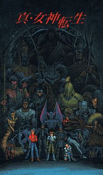
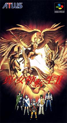
See these box arts? Theyre all different. The first one is a edgy looking painting of all of the demons looking cool. Boobs, cool lions, skeletons! Its got everything a edgy teen in the 90s could want in a cover! The second one shows the main cast of characters standing there looking cool. Above them, angels singing out in an immaculate chorus (Down from the heavens descended Chuck Norris!). Also looks cool. If... just looks bad, easily the worst out of the three.


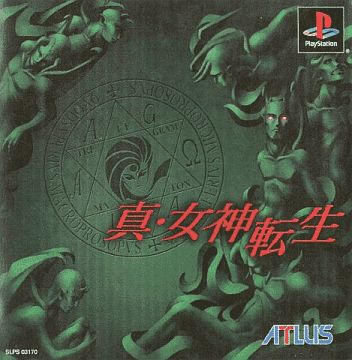
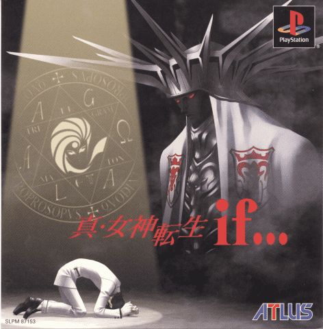
Now look at these 3. All original, completely different for the Ps1 remakes. The first one is a dark wall with the series logo engraved on it. Around is demons sculpted to look like gargoyles on top of a gotham building. It sets the tone for a dark, isolating game. The second is angels falling down from heaven, wrapped in chains, banished from god's light. Completely blank expressions, lying motionless. Its less designed to look cool, and more to make you intrigued, and have questions. Lastly we have if... which shows a crying Hazama in complete anguish over his sins. A spotlight is cast upon him which reveals the series logo.
You see what I mean? Theyre all original in their imagery, and set the tone for their stories. Even atlus can do a face close up right. Its magic! Of course theyre not perfect, just take a look at IV's art if you know what I mean, but theyre a lot better than the competition.

Now lets take a step back from Jrpgs and take a look at Call of Duty. Terrible games but the older art is great. The only compliment I have for the series though.

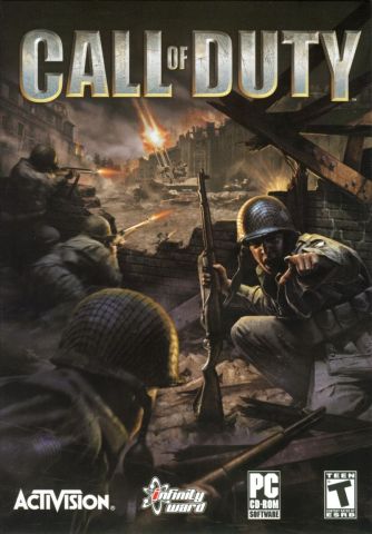
Theres action in the background. Soldiers hiding behind cover, the enemy forces far away from them. In the foreground, a soldier pointing towards you screaming with a look of indescribable horror in his face. Whats he pointing at, has he gone mad? You can only find out if you play the game.

...
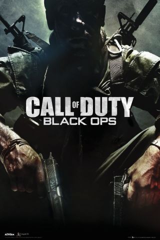
I have no words for this absolute trash. How could you go from what I just talked about to THIS! Random cool looking up close army guy, as generic as can be. Its insane to think that you could ruin a box like this. Anything else wouldve worked!
How to fix this? There really is no way to. Just buy more games that look better artistically? Try to learn graphic design in hopes youll be hired? Theres not really much you can do. The responsibility lies solely on the companies who make these games.
Anyways I had more examples but you get the point. Thanks for reading up to this point, your support means a lot to me.
